Dashboards configuration
Dashboards are configured from a SOQL query for which we add elements such as graphs, a map and / or the data table.
In this article
Access
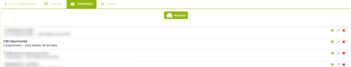
The list of available dashboards is accessible from the “Dashboards” tab of the administration page.
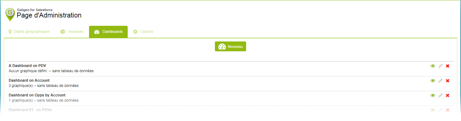
Add a new dashboard by clicking on the “New” button. The user is then redirected to the configuration page.
The configuration page consists of two parts:
- Settings
- Preview
Settings
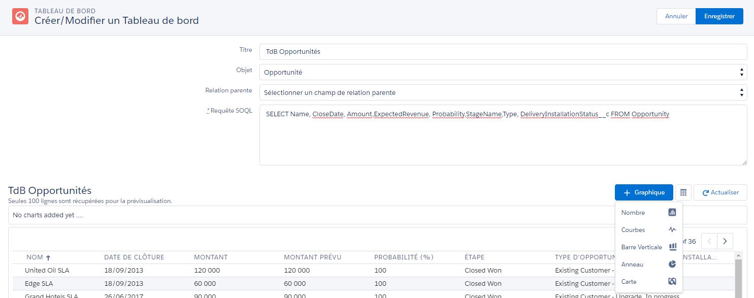
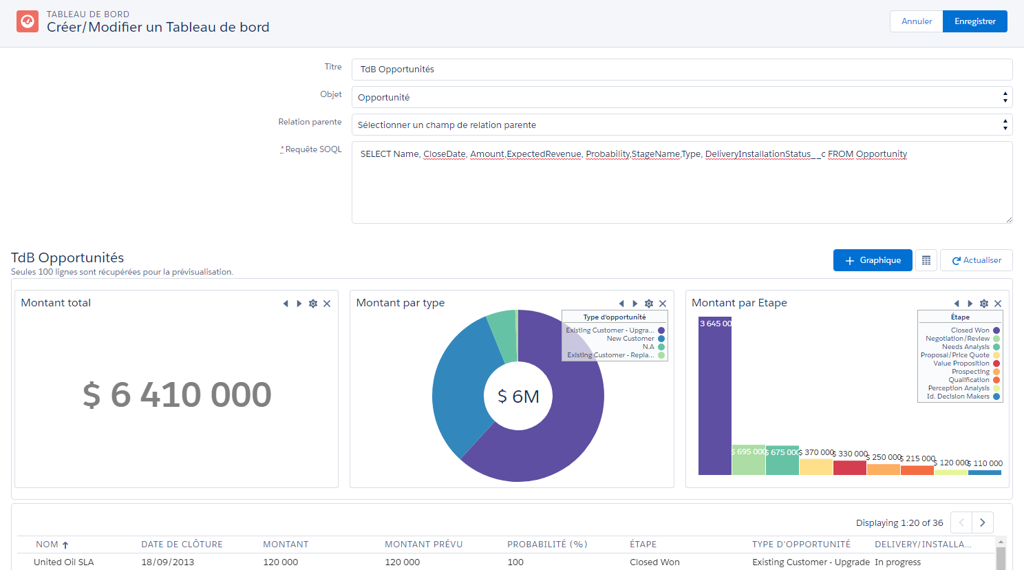
When setting up a dashboard, the user is asked to enter:
- A name
- The type of object the dashboard is on
- Possibly the field to identify a parent. For example, keeping in mind a diagram of the relationship between accounts and opportunities, it’s possible to create a dashboard on opportunities only on selected accounts by choosing “Account ID” in the list of parent relationship fields
- The SOQL request that will be used to retrieve the data, used to feed the various graphs
You can find more information in the Salesforce documentation on how to define a Salesforce Object Query Language (SOQL) query.
Preview
In the preview section, it’s possible to change the parameters of the graphs, their display order or to delete them.
Each component has a set of icons at the top right:
 : reorder the component
 : change the properties of the component
 : delete the component
The data table will still be visible here, but an option allows you to display it or not in the final dashboard. Note that this preview only returns the first 100 lines.
Below the SoQL query input, there are three buttons:
 : add a graph to the dashboard
 : display or not the data table in the final dashboard
 : refresh the data according to the query
Visualizations
5 types of visualizations are available:
| Visualization | Use |
|---|---|
| Number | Display a simple numerical value |
| Bar chart | Comparison of a data series |
| Donut chart | Contribution of each value in proportion to the whole |
| Line chart | Variation in value over a period |
| Map | Map of the points of the selection |
Apart from the “Map” component which does not require any configuration other than the title, others have parameters of their own.
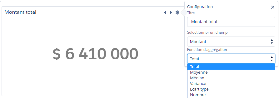
Number
It displays a numerical value and is configured by choosing the field to be aggregated (among the numeric type fields) and the aggregation function.
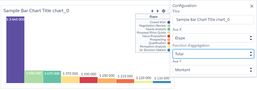
Bar chart
This component displays data according to a category defined on the X axis. It’s configured by choosing a field for the X axis, an aggregation function and a metric.
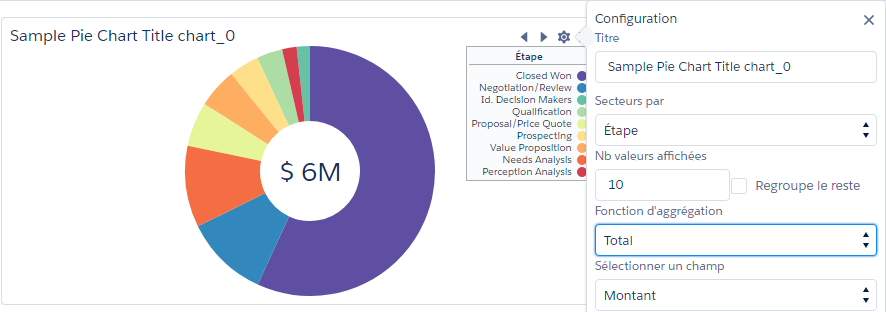
Donut chart
It displays data by category and represented as a sector and sorted in descending order. It’s configured by choosing a field to qualify the sector, an aggregation function and a metric. It’s possible to limit the number of values to be displayed and possibly group the other values in a sector which will be named “Others”.
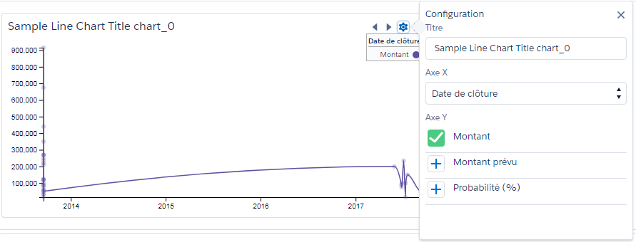
Line chart
This component allows to display the evolution of a metric depending on a time series. The fields available to define the X axis must be of the type Date or DateTime. The addition / removal of series is done by simply clicking on the icon next to a metric.
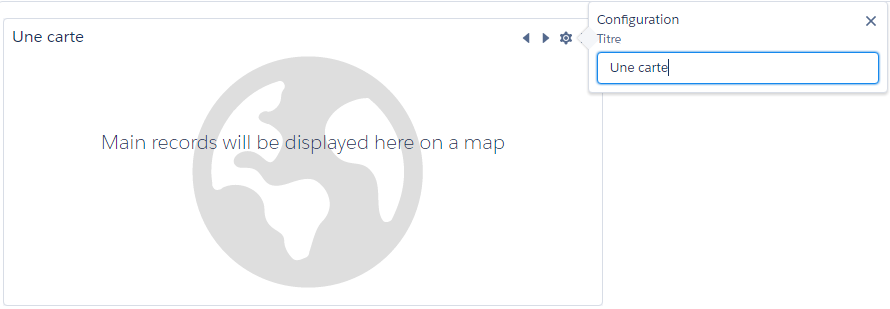
Map
This component displays as an image the points selected from the selection tool and for which the dashboard has been refreshed. Only the title is configurable.
A complete configuration example of a dashboard based on Opportunities:
By clicking on the “Save” button, the user is redirected to the list of available dashboards.
By clicking the  icon, it’s possible to see the dashboard as it will be visible to the end user.