Map User Interface
General presentation
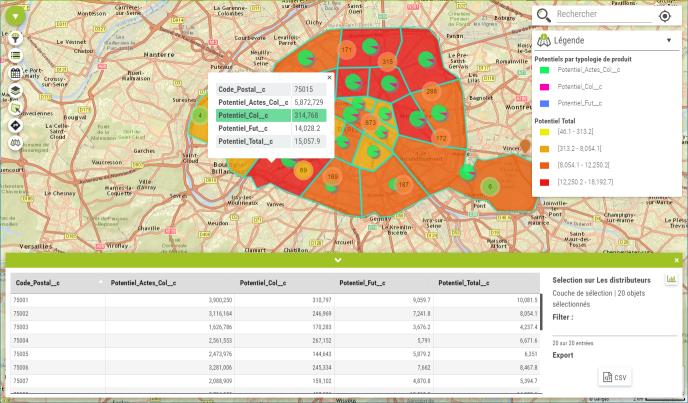
The map viewer offers a powerful and a great user experience to visualize and analyze your data:
- Visualize and manage your Salesforce object data on map
- Plan an event related to a record
- Navigate and explore your data analysis
- Select area or point of interest and calculate new metrics and statistics
Toolbar
 |
 |
The toolbar contains the links to all functionalities available in the application. At the opening, the tool is collapsed (see picture on the left). When user moves his mouse over it, the toolbar expands and collapses on mouse out. To stick the toolbar opened, user only needs to click on the toolbar icon. |
Map Visualization
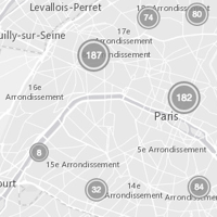
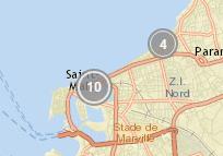
The map manages the data cluster, depending on the map scale. The smaller the map scale, the more split are the clusters into single markers. Images below show the same area at two different map scale.
 |
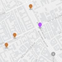 |
| Clustered markers | Split markers |
Galigeo for Salesforce offers the option to de-activate clusters in order to visualize all markers individually:
 |
 |
 |
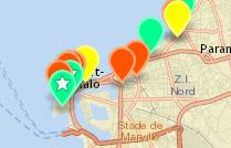 |
| Map with clusters | Map without cluster |
 |
Using clusters improves the application performance. When displaying more than 1000 markers, we strongly advice to stick with the cluster mode. |
Information window
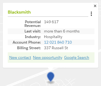
The information window has:
- A link to the Salesforce page of the object
- Main info about the object from standard or custom fields
- Custom Actions
- Standard Actions
- A dropdown list of dashboards
