Fall 16 Release
This document describes improvements made to Galigeo for Salesforce in this lastest release:
- Analytics take on a new dimension
- Displaying Points of Interest (PoI)
- Easily choosing where to display Object information
Use the links below to install this new version.
| Sandbox | https://test.salesforce.com/packaging/installPackage.apexp?p0=04tb0000000Y0Cm |
| Production | https://login.salesforce.com/packaging/installPackage.apexp?p0=04tb0000000Y0Cm |
Analytics take on a new dimension
End users now have access to a lot more information on the same map! (in particular, thanks to visibility thresholds and newly available thematic analysis). On the Admin side, the ease of creating and deploying Analytics is greatly improved.
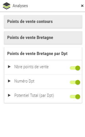
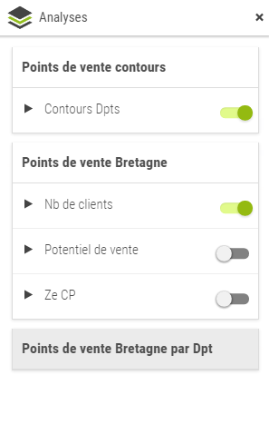
An overview of what is possible to achieve with Analytics in Galigeo for Salesforce:
In this example, you notice:
- Visibily thresholds allowing the user to access different visualizations according to the zoom level
- A Label Thematic to display postal codes labels
New Thematics
Unique symbols and labels are now available when creating a new thematic.
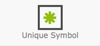 |
Unique symbols (New) Allows to draw the contours of a shape. |
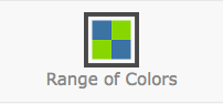 |
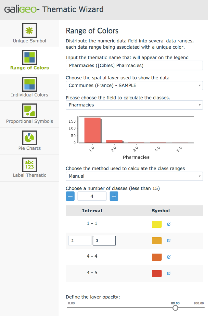
Range of colors Distribute the numeric data field into several data ranges, each range being associated with a unique color. New: Thresholds can be set manually |
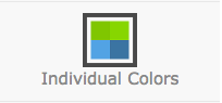 |
Individual Colors Display data from a single field on the map in the form of colored symbols, each color being associated with an individual data value. |
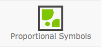 |
Proportional Symbols Represent the dimensions by symbols whose sizes are proportional to the indicator values. |
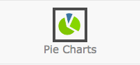 |
Pie Charts Display data from multiple fields on the map in the form of pie charts with colored slices representing each field value at the geographic location. |
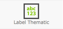 |
Label Thematic (New) Display the value of an indicator as a text label on the map. |
Manually assigning ranges of values with colors (choropleth)
On top of automatic methods to determine ranges of values, you can now manually set thresholds of your choice.
For instance, to set apart geographical areas where an indicator is positive from those where it is negative, you can:
- Add a threshold of value 0
- Assign red to negative values
- Assign green to positive values
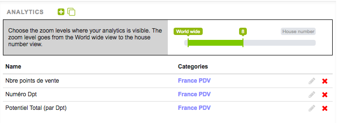
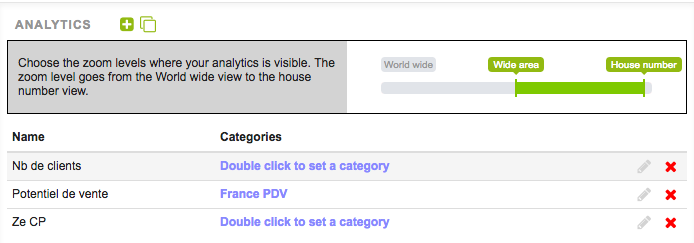
Visibility Thresholds
With visibility thresholds, you can choose the zoom levels where your Analytics is visible.
The zoom levels span from world wide view to house number view.
In the example below, we created analytics displaying information at an area level (french department). So created analytics are displayed only for higher zoom levels. For lower zoom levels, we display the same data at a postal code level.
Also note that Analytics hidden at current zoom level show as disabled in gray.
| Analytics on french department | Analytics on postal code |
|---|---|
 |
 |
 |
 |
Cloning Data Sources
Cloning data sources is a fantastic time saver for Admins. Once defined a data source and its analytics, the Admin can clone them and easily set up the same analysis for other geographic area or for other segments of the records he is working with.
Creating everything from scratch is history, phew!
In the documentation, you will find a detailed example showing how to copy an analysis based on Accounts with a ‘Client’ Record Type, duplicate and modify it, to analyze Accounts with a ‘Prospect’ Record Type.
It is also possible to clone an Analytic.
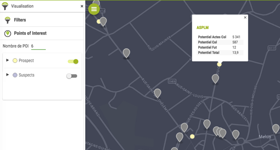
Displaying Points of Interest (PoI)
Points of interest allow to answer numerous Sales teams’ needs in an easy and flexible way.
Let’s assume a Sales Representative works on a map displaying Accounts. After a meeting with a customer, the Rep wants to make the best out of the journey and visit nearby prospects.
On the same map, the Rep can display “prospects” coming from a different Salesforce object. It is possible to display the closest 200 propects around the customer the Rep just left. The Rep has access to info window, stats table and tooltip for every prospect in order to view their related information.
Easily choosing where to display your Objects’ information
Selection table
First, selecting the fields you want to display in the application is now simpler.
By ticking boxes in one single table you decide whether to display or hide fields in the info window stats table and the tooltip. An info-bubble is also there to give you a sense of where those 3 lists are used in the end user interface.
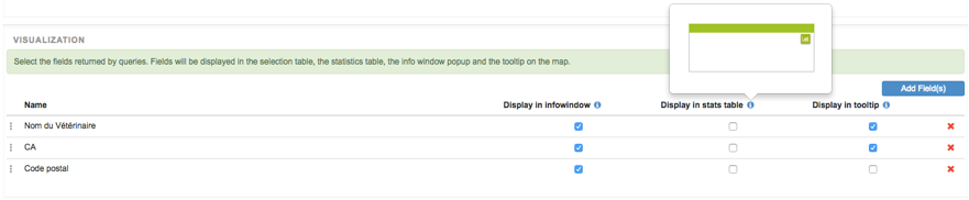
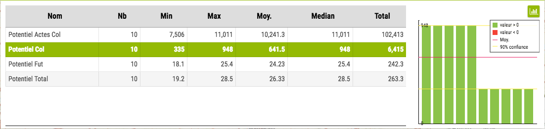
Fields Used for Statistics
As stated above, it is now possible to choose the fields you want to use for statistics. For example to avoid showing average of percentages… Good news!
That’s all for now!
Please feel free to send any comment or question you might have: support@galigeo.com